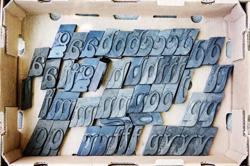
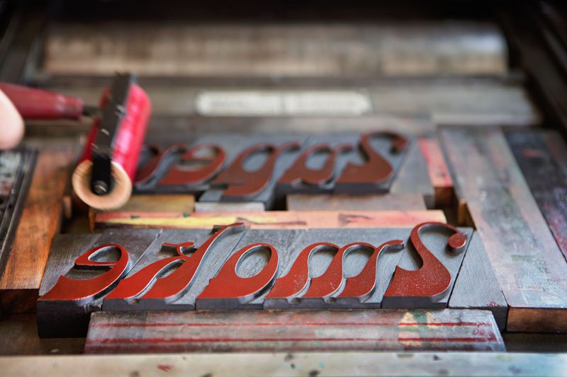
It’s called Super Smoke—or sometimes just Smoke. At first glance, it looks like something off a Haight-Ashbury concert handbill. “The psychedelic movement adopted this font,” says Marie Oberkirsch, director of Central Print, a nonprofit print studio in Old North St. Louis, “so it does look very ’60s and ’70s.” But Super Smoke dates to the mid-19th century—and that’s where this story starts.
Around 1889, a “Mr. Lelli” founded Przewodnik Polski, or Polish Guide, on St. Louis’ Near North Side. In 1905, it was handed off to a parish priest, who didn’t know what to do with it. He begged his sister, Helen Moczydlowski, to move from Wisconsin to help. She and her husband, Boleslaus, bought a building at 1308 Cass, set up house, and put presses in the basement. The Moczydlowskis odd-jobbed posters, wedding announcements, and handbills, but their main task was publishing a paper every Thursday. They translated world and U.S. news into Polish, peppering it with neighborhood items.
Get a weekly dose of home and style inspiration
Subscribe to the St. Louis Design+Home newsletter to explore the latest stories from the local interior design, fashion, and retail scene.
After their father died, Mrs. Moczydlowski’s children showed up every Wednesday to help run the presses and wrap papers for delivery—but it was the eldest daughter, Helen Muenz, who became editor and publisher in 1925, when her mother died. The last issue was printed on November 9, 1969. That Sunday, Mrs. Muenz went to St. Mary’s complaining of chest pains. The following Thursday, rather than reading her newspaper, the St. Louis Polish community gathered for her funeral.
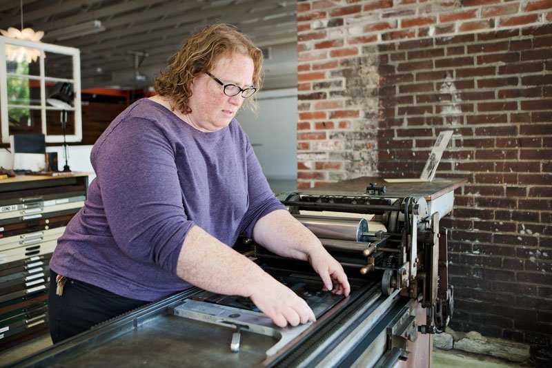


In 1980, the Polish Publishing Building was still standing, but vacant. That summer, Tom Bratkowski, a third-generation Northsider whose mom and aunties knew Mrs. Muenz (they used to bring her news items), noticed the doors of the building were wide open. “That’s a bad sign,” he says. “I went in there, and the fixtures had been stripped out, and the fireplace, the bathtub and so forth.” He phoned Mrs. Muenz’s daughter, Helen Ortbals, asking permission to go in and to save anything of cultural value. Bratkowski discovered two small presses—and several boxes of type—in the basement. He was teaching biology at Maryville University at the time, so he asked the art department if they could use the presses; when the answer was a resounding yes, they assembled a rescue crew, and drove down to Cass with a truck equipped with a lift gate. Before the day was over, the weight of one press collapsed the stairs, and everyone was covered in soot. (Tom took them all to Crown Candy and bought them a double round of malts as a thank you.)
But they had no use for the old wooden type. So Bratkowski stowed multiple boxes of it the loft of his garage. Though he pulled out a Steamboat Gothic typeface to create a masthead for the Hejnal, a quarterly for St. Louis’ Polish American Cultural Society, the rest of it sat undisturbed for decades. “I thought, well, there’s going to be some kind of ultimate purpose for this, so I can’t throw this stuff away,” Bratkowski says. Then, it occurred to him he could give it to Central Print, a nonprofit print studio in Old North that’s mere blocks away from where Polish Publishing once stood. (It was demolished in the mid-1980s and replaced with a Kentucky Fried Chicken. Which, Bratkowski dryly observed in an editorial for the Hejnal, at least the logo was in the colors of the Polish flag.)
When Oberkirsch opened a box filled with huge back-slanted letters and numbers, she knew that she was looking at something rare and special. Not only was it a complete set (the only character that doesn’t have a duplicate is the number 8), but it was in remarkable condition. She contacted Central Library, and the reference librarians immediately located a catalog from William H. Page, the Connecticut company that produced it.
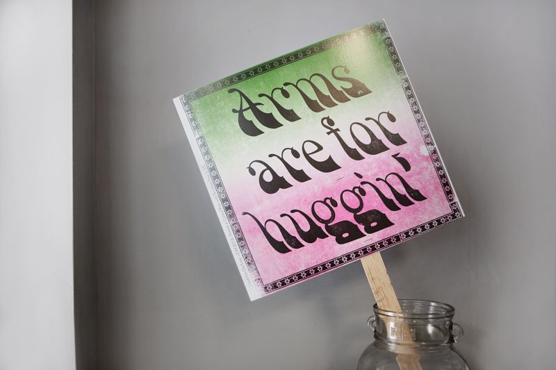
“That helped us identify it as No. 111,” she says (or, if you want to use the more poetic name, Super Smoke). It was produced by hand, the basic shape being carved with a router, “then, you’d sharpen up the inside edges by hand with a chisel,” she says. She hasn’t pinned down the exact date of production, or the name of the designer, but she knows it predates 1891, when Page was sold to Hamilton, who sold a softer, rounder, less intricate version. In March, artist-in-residence Karen Zimmerman took it for a test run, printing a protest sign for the March for Our Lives. “She spelled out ‘Arms are for huggin’’ because we only had two lower-case gs,” Oberkirsch says. “We didn’t have a third. These are the adjustments you have to make a printer when you’re using old material.”
Both Bratkowski and Oberkirsch admit that the size and the fanciness of Super Smoke makes it a little bit of a mystery as far its use. Posters? Ads? They don’t know. “Because of the size, it would make a great header for a magazine,” Oberkirsch says. “But it’s a difficult script to read. You’re not going to put it on a WANTED poster. It’s contradictory. I think of Alphonse Mucha, or Toulouse-Lautrec. But I don’t think you can nail it down,” she laughs. “It’s an enigma.”
Central Print hosts a lecture on Super Smoke on August 25.