
Before reading our Q&A with artist Marco Brambilla below, you should watch this short clip from “Evolution (Megaplex),” his piece currently on view at the Saint Louis Art Museum. Know, though, that to really experience it, you’ll need to sit in the near-darkness of Gallery 301 with a full-screen projection. “Evolution,” set to a score of Sergei Prokofiev’s “Dance of the Knights,” tells the history of the world through movie imagery, much of it clipped from iconic films like E.T., Dirty Harry and Star Wars. It feels like a huge, scrolling Hieronymus Bosch painting popluated with Hollywood archetypes: gladiators, dinosaurs, Jedis, cowboys, astronauts, soldier, pagans, aliens, and tough guys. Explosions and lightning bolts are everywhere; a metallic sun peeks up and down on the horizon, and a small, burning figure falls from the sky. It’s sublime, but also deeply funny. You can’t take it all in just one three-minute cycle—though you get the sense your brain might not ever be capable of taking in every detail, even after multiple viewings.
Brambilla calls this technique “video collage,” and it’s meant to cause sensory overload, as well as re-contextualize cinematic pop imagery (Brambilla worked in Hollywood for a while; he’s the director of the 1993 feature Demolition Man). “Evolution,” is the second part of a trilogy, which began with “Civilization (Megaplex),” (2008), installed in the elevators of the Standard Hotel in New York City. That scrolls vertically and simulates a rise to heaven, or fall into hell, depending on what direction you’re traveling.
Stay up-to-date with the local arts scene
Subscribe to the weekly St. Louis Arts+Culture newsletter to discover must-attend art exhibits, performances, festivals, and more.
The final installment of the Megaplex trilogy, “Creation,” (2012), moves in a spiraling-outward motion, like an unzipped DNA strand, or Yeats’ widening gyre. Set to Prokofiev’s Cinderella Waltz, “Creation,” like the other two works, is gorgeous, overwhelming, and humorous. You begin at the Big Bang, and soon verdant pastures and oceans are spiraling by, as well as unicorns, Julie Andrews in The Sound of Music, disco balls, dolphins, and dancing girls. Then, as JB’s Big Boy and the Statue of Liberty’s head bob by like so much space junk, you unwind out into the chilly cosmos, watching the trappings of civilization float away. (And everything starts over again.) Last March, “Creation,” was shown in St. Patrick’s Basilica in New York, accompanied by live orchestra and chorus. The image of wearing 3-D glasses in church seems like kind of a funny notion (all three works can be projected in 3D) at least till you watch this clip. Then you realize that perhaps this is what awe looks like in the post-postmodern age.
Last week, we sat down with Brambilla, who was in town to give a talk at the museum, and Tricia Y. Paik, associate curator of modern and contemporary art, who organized the exhibit.
This interview has been edited for publication.
First of all, after watching the piece several times, I can’t even begin to wrap my head around how you put this together technically—is it just a matter of hunching over a laptop and stitching in a fireball here, an astronaut there…?
It starts very low-tech: as a photo collage, images from different films, done as still images. And I lay out, in this case, on a very long canvas; this piece is inspired by the Museum of Natural History murals, these kind of chronological dioramas. I work in that very low-tech way for a few months, and move elements around and get the composition to where I like it. From there, I move into Photoshop, and then from there we move into motion. So the composition is, say, eighty percent done, but each character has to be cut out, which means sending the material to, in this case, the Philippines, to have a team of 30 people cutting out the characters. Usually it’s about two seconds of material. The characters are removed from the background, and then they are looped and recombined into this new landscape. Once that’s all done, and everything is moving in a synchronous way, the backgrounds are mapped. We project these textures onto 3-D [digital] objects, like the coliseum. So if you were to take the camera and move it to the side of this situation, you would see a 3-D terrain…you could take the virtual camera and say, OK, we’re going to look at it this way, and you’d see this whole thing is crumpled and deformed depending on whether it’s foreground or background. And what we do with the characters, it’s the equivalent of a pop-up book. Each character has its own plate, and the density is determined by the number of characters and the number of plates in there. Technologically, we have to use the latest, state-of-the-art equipment to handle that much information, because there are about 400 film clips and about 2,000 individual video channels, synchronized and all moving at the same time—every cloud, every thing is a separate video channel.
I’m sure before you even start on the lo-fi version, you’re watching films and thinking about what to pull?
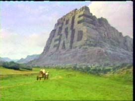
Yeah, there’s a point at which I create these milestones; in this case, it’s a chronological piece, so those milestones are fairly literal, where you can get your bearings on where you are in chronological time, whether you’re in the past, present, or future. And then there are certain contradictions within that that I put in, but the roadmap is fairly easy to understand. So I was able to have a little more fun with this one, because I was able to contradict certain spans of time—so you have characters from the future. So the idea is that you’re traveling from the dawn of man to the evolution of man, the enlightenment of man, the post-human character from 2001: A Space Odyssey at the very end, before the Mel Brooks’ [end credit from History of the World, Part 1] THE END. So, once that is mapped out, it becomes slightly less logical, because that’s when I start watching more movies as I’m working on it. Because then for me, it becomes a stream-of-consciousness exercise, where I’m basically making associations that may be quite elliptical and wouldn’t necessarily make sense if you were designing it as logical, chronological piece. But they do somehow make sense, because two characters may be moving with similar motions, or using similar hand gestures, or the props they’re holding may connect one to the other. That’s the most enjoyable part of the process for me, this kind of stream of consciousness phase of it, where I’m watching four of five movies a day, usually in fast-forward, looking for elements to fill in and populate the piece. But then, every element suggests another association, and another association. My background is film, I am quite a film buff, and have been since I was a child.
So a lot of these references you might just have in your head.
Yes, to an extent. You wake up in the morning, and you write things down, and most of it is not logical. But then for some reason, whether it’s the color palette, the gestures, the motions, or the actor—you may have an actor playing two completely different roles in different films, but those two work in context. Then it reaches across the whole lexicon of film, in as much as you’re really dissecting the idea of content from presentation. So, on one level this piece is really about divorcing content from presentation and spectacle. If you were to remove all the dialogue, remove all the context for these characters, you would be left with essentially leaving these characters as brushstrokes on this giant canvas. You’re eliminating original content, and creating a new form. And that’s where it echoes what’s going on in Hollywood right now, where content to a degree has become interchangeable. I’m talking about the large budget 3-D films. The content is often interchangeable. The storyline, the narrative, the dialogue, are modified to the point where you could watch five trailers and you could think that they were all bits taken out of the same film, because there’s so much computer-generated imagery, there’s so much filmmaking by committee that generates this kind of lack of originality. So, on one level all three pieces in the Megaplex series really comment on the transition of the film industry into a post-content form.
A lot of those little characters doing their gestures over and over again also reminded me a lot of Tumblr, and the current dominant form on the web, the animated GIF.
Yes, or like Vine, right? I thought of them as trapped in amber…these characters are forever trapped in this canvas, where they have no intention, and there’s no beginning or end—there really is no fulfillment at the end.
So as I watched the scenes scrolled by and spotted some AT-ATs, it occurred to me that this might also be a tricky project because Hollywood, and the entertainment industry in general, is so wired about intellectual property and copyright. Is that ever a hurdle with these pieces?
It’s not broadcast commercially. And there are over 300 films sharing screen space, so it’s very far removed from its original source material. And they’re also very short; most of them are about a second, and are slowed down.
Tricia Paik: And so it’s like sampling, where if it’s more than a couple of seconds, you have to pay?
Not really. If you look at Christian Marclay’s piece, that has dialogue and whole scenes. I think it’s the fact that it’s not for commercial distribution.
These images are almost so commercial and passed-around they are burned out, anyway, so part of it is about putting them in an out-of-context place so that we can really see them, in a way?
Right. And they become signposts, in a way, because they are in our collective consciousness. Everyone sees different things; depending on how film-literate people are, they all see different patterns in the same canvas.
So the Megaplex series as a whole started with the piece in the elevator at the Standard Hotel in New York.
That’s correct. So that was the first one, “Civilization (Megaplex),” this one’s “Evolution (Megaplex)” and the last one is called “Creation (Megaplex)”. So, they’re all these very bombastic, historically relevant human themes, but seen through the kind of insanity of pop culture. So it’s how we commodify these divine, human themes into something contemporary and somewhat disposable, in a way. None of the imagery used in any of the pieces is really considered culturally significant, it’s more pop culture; that’s the language in which it communicates.
Though there are art history references there—Hieronymus Bosch of course.
And Breughel.
Dante also, in the first one.
Yes, that one has a very clear mythical track where you’re in the Inferno, you’re in Purgatory, you’re in Heaven and this divine area, where it’s delineated into a very clear series of environments. And the last piece, it’s much more free-form and abstract. It moves through nine different environments, which are more metaphysical than religious.
With the trilogy finished, what are you working on now?
I’m working on an installation, which is collaboration with NASA; I’ll be shooting it the rest of this year.
TP: There’s also an early work from 1998 called “Cyclorama,” which actually featured St. Louis.
Yeah, St. Louis is actually the center, it the first city I shot, because of the geographical location. So, “Cyclorama” was a cylindrical room with nine television monitors. Each monitor would show a time-lapse sunrise in a different city, from a revolving restaurant. So, the camera itself was articulated and moving, and in each city we would set the cameras the restaurant would start the requisite number of degrees from the sunrise, so we would meet the sunrise in each city. It started with St. Louis because that was the Central Time Zone, and it had the reference point. Spreading out from there we went into the Eastern and Pacific [time zones], and there’s three restaurants from each of those time zones. And in post-production I was able to synchronize the movement and all the sunrises. So you walk into this cylindrical room, and you’re looking at a kind of universal, American sunrise, where we’ve erased the time zones. So it’s everywhere and nowhere at once So it’s about sensory overload, and how that affects your mental state; does it make you feel more connected, less connected, having that many levels of variety and stimulus. It was nine cities, all at eye level, and all panoramic.
So, I was watching a clip of “Anthropocene,” the one shot in Central Park, and the visuals and technical approach seem completely different. Can you talk a little bit about that piece?
That’s using this technology called Lydar, where I mapped from the southwest corner to the northeast corner of Central Park. Of course, Central Park is completely man-made, so I wanted to capture it with a very synthetic, non-photographic, non-representational technology, so it’s essentially a time capsule of exactly where every leaf and every person was in Central Park that day.
That piece, I suspect, maybe translates a bit better to YouTube than the Evolution series, maybe because it’s less dense? And it’s more about color?
Yes, it’s more about just the raw data. [The Metroplex] pieces are much more effective projected. The larger the scale, the more the characters become life-sized.
TP: What I think is really significant about your work is how important space and architecture is, for your bigger installations, like Cyclorama, or on the Christopher Grimes website, there’s that stunning footage of the showing of the third part of the series, “Creation (Megaplex)” at St. Patrick’s.
Oh my gosh, yes! At the church.
I think the humor of it is pretty significant too; a lot of artists seem really afraid of it, for whatever reason. There are some really hilarious touches in this piece, like the lady on the giant phallus at the bottom of the screen about halfway through, or the airplane with the HAPPY FOREVER banner.
And that’s intentional. The subject matter there is kind of apocalyptic, yet has this euphoric feeling to it. It was very freeing to add elements like that, because they can kind of anchor the satire of it. And all three of these pieces are meant to be satirical.
Also: Kanye West! Man of the hour. You produced a video for him. As I was strolling through the Early European Art galleries at the museum, it actually reminded me of the visuals you did for “Power.”
Well, it actually references Renaissance paintings. It was originally mocked up using poses from all of these Botticelli and Michelangelo, and that was made originally, and then set into motion with the actors. It was all done on blue screen, shot on one day, with 40 little vignettes. But I pre-visualized everything, so we were able to do it very quickly, and the composition is actually almost identical to the one that was made for the painting at the beginning.
And then, you were bombarded with requests from other musicians.
Yes, Katy Perry, Justin Beiber and all of these other people. So, they’ll call you and say it’s an art collaboration. What do you mean? So you hear the lyrics, and you’re like, ah. I don’t really listen to a lot of pop music, so when I heard the Katy Perry lyrics, I was like, oh, wow, so that’s what’s going on! [Laughs.] Kanye West called me because he saw the piece in the elevator, and it was quite good to do something like that. I interpreted his music, and that specific album is satire as well, so sensibility wise, it worked quite well.
But music’s an important part of the process of what you do, whether or not you’re collaborating with musicians. How do you choose sound for a piece?
Sometimes I start with the music. Sometimes it’s purely sounds and live recordings. Like for “Cyclorama,” they were live recordings from the rooftops from the different revolving restaurants. And with the Megaplex series, it was music which had influenced composers from the golden age of cinema scoring such as [Bernard] Herrmann, who referenced Stravinsky and Prokofiev. The music was really the same kind of prototype they were using. These very larger-than-life, very bombastic film scores, in this golden age of film scoring, with like [Ennio] Morricone and Herrmann. So I went back to that source, and I felt like it had to have this sort of processional feeling to it. It also needed to strike that balance between satire and the presentation of it, and the timelessness of it, so I thought a classical score would definitely be the way to go. And all of those pieces have also been sampled so many different times in so many different music scores.
So what else is important for people to know before they go sit in that small, dark room and watch “Evolution”?
I think it’s important to experience in a large scale, in a gallery or a museum. The problem is, when you look at time-based art, having excerpts or clips posted on gallery websites or YouTube, you miss the intention of it, especially for the Megaplex pieces, where you don’t really have the resolution or the scale to understand a whole level of the piece, which is really about sensory overload. You’re missing that whole component if you watch it on a computer.
“Marco Brambilla: Evolution (Megaplex)” runs through March 30. You can view it in Gallery 301 at the Saint Louis Art Museum, 1 Fine Arts Drive. Hours are Tuesday–Sunday, 10 am–5 pm Friday, 10 am–9 pm. For more information, call 314-TKTK or visit slam.org.


